Created and implemented Ampla's Design System from scratch to ensure consistency and accessibility across the platform.
Role
Senior Product Designer
Company
Ampla
Year
2023-24
Senior Product Designer
Company
Ampla
Year
2023-24
Problem overview
When I joined Ampla in January 2023, the team lacked a design system, and the two other designers weren't utilizing components to construct their designs. Although there was a color palette, type styles, and button styles in place, adherence to these elements was inconsistent without an established Design System Figma Library.
Streamline work for designers and engineers
I found that our designers were often creating similar design elements from scratch. We frequently had to check in with one another to find existing pattern, which disrupted our workflows and created inconsistencies user experience across our products. This also created a bottleneck for our engineering partners who were building UI elements as one-off instances instead of pulling from a library of global components.
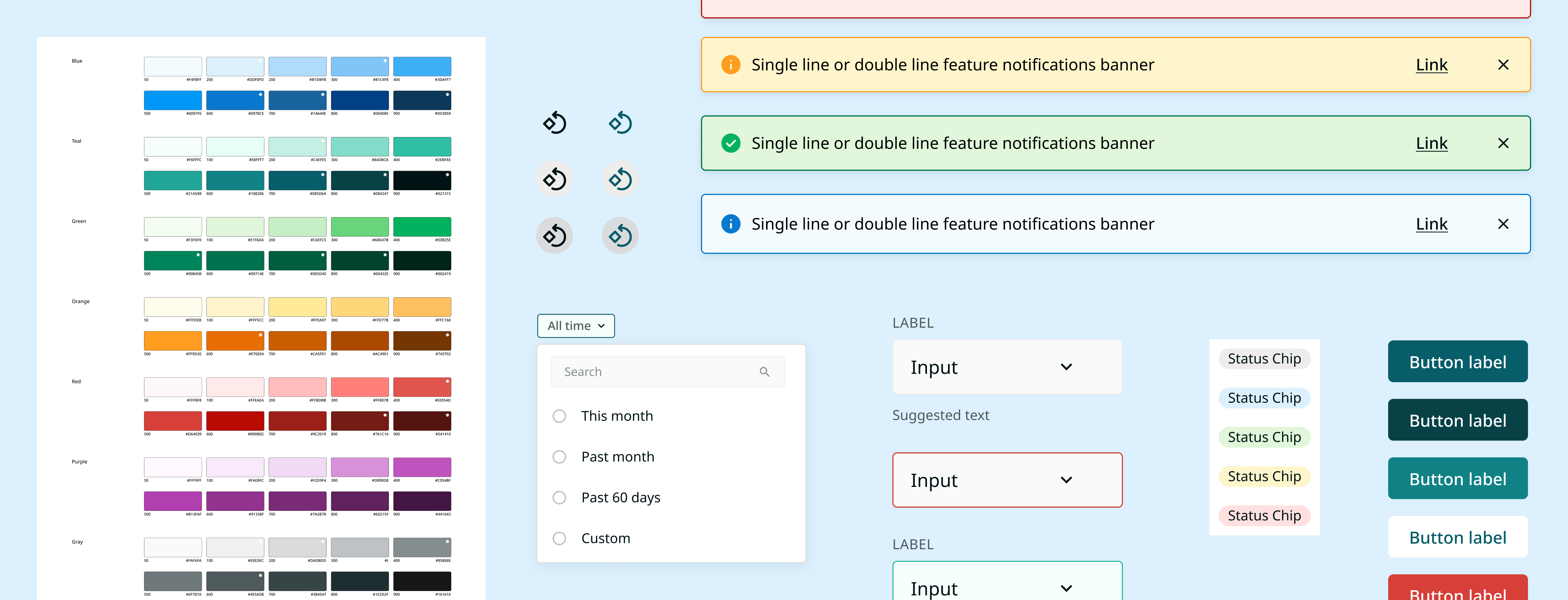
To get started, I conducted an audit to collect and compare existing color and type styles across our Figma files and production.
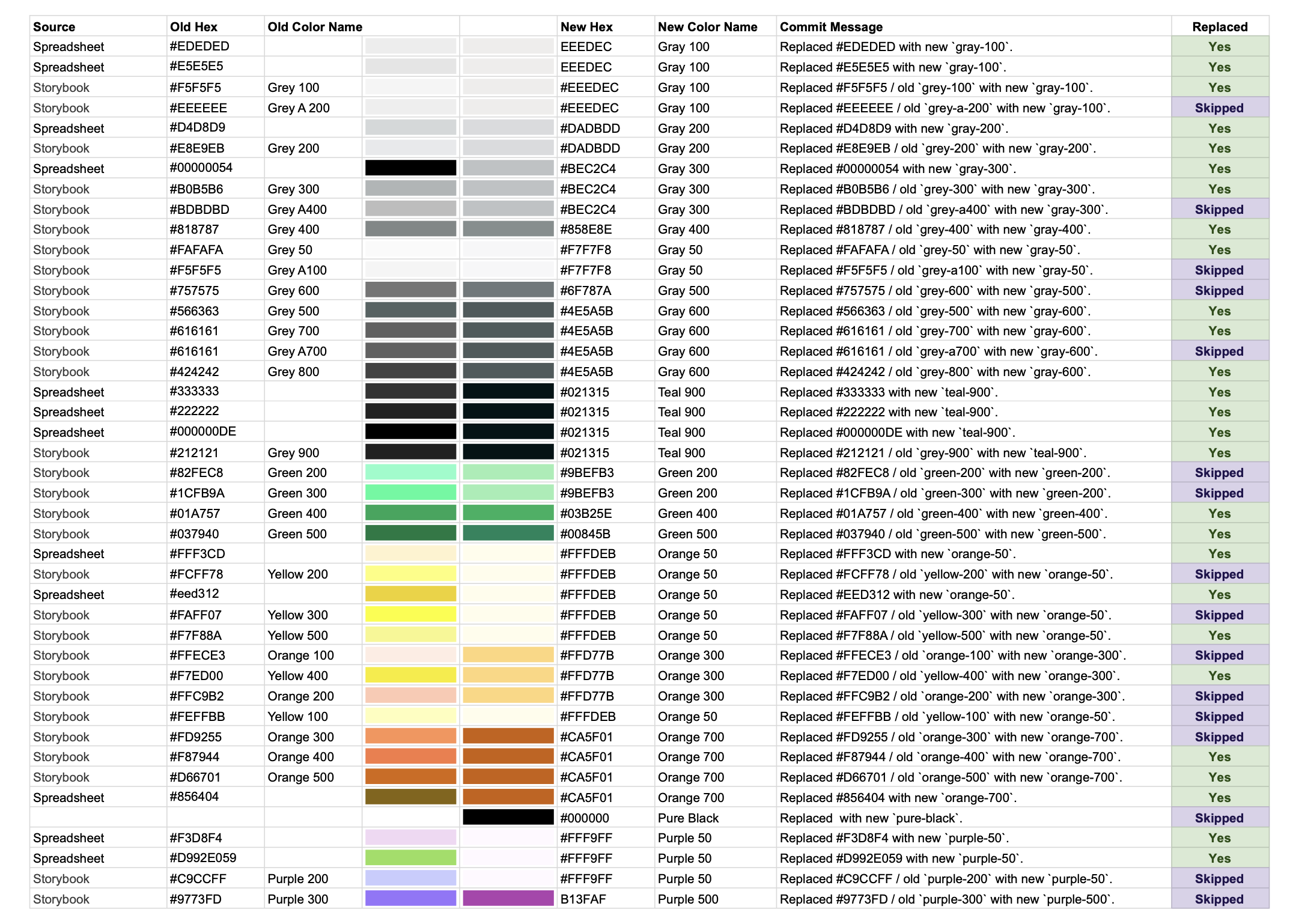
Setting a foundation with color and type
I began constructing the design system by laying down foundational elements such as colors and typography. I locked down a color palette, and typography system before beginning to work on the other components.

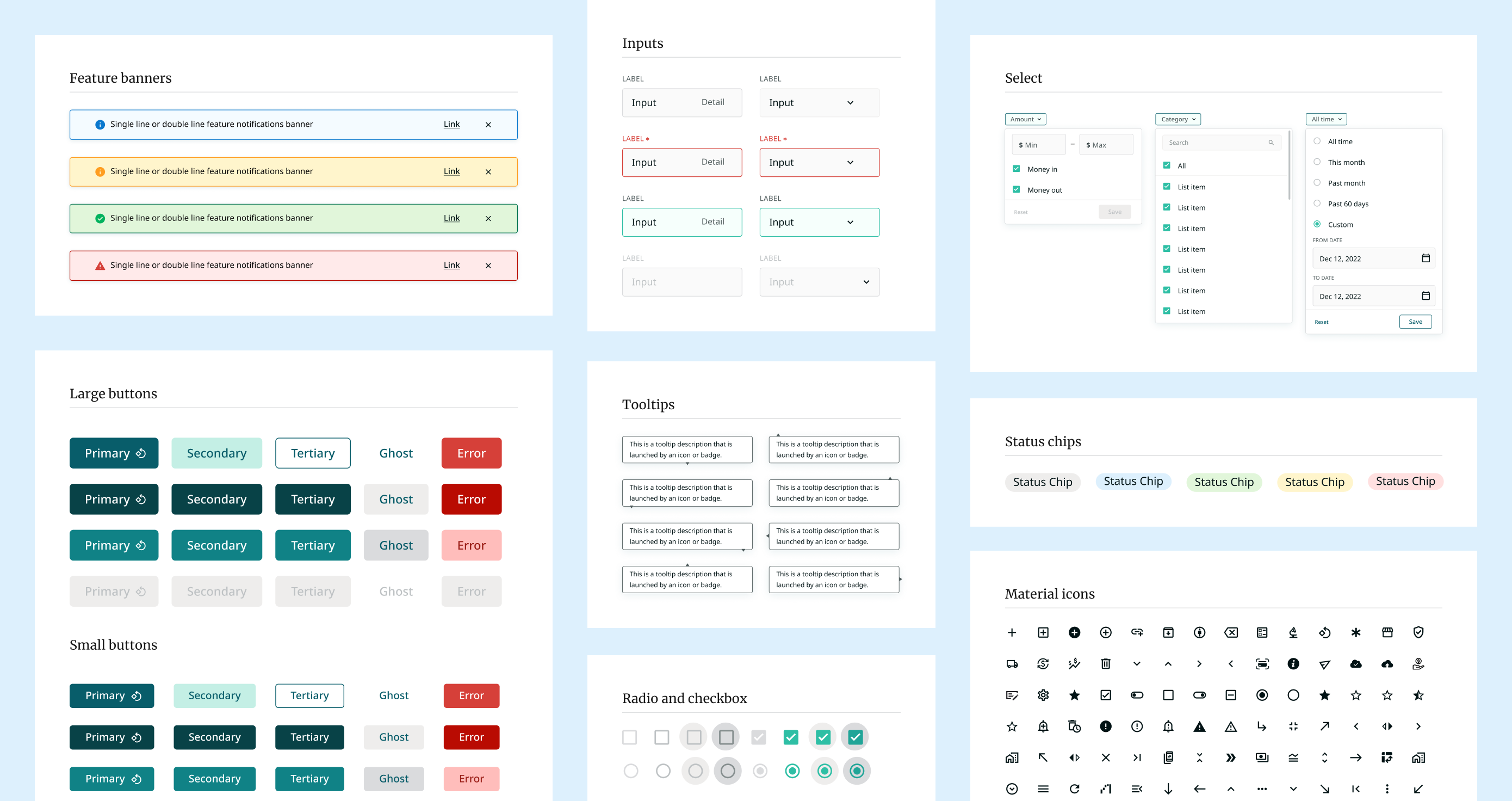
Designing a component library
Progressing further, I developed components for button and link styles. My objective was not to overhaul what the team was already using but to establish an accessible common denominator to ensure consistency across design files and production.
After establishing this foundation, I collaborated closely with the other designers to ensure their comfort and capability in contributing to the design system. The system remains a work in progress, with all three of us actively contributing.
Documenting rules for clear use
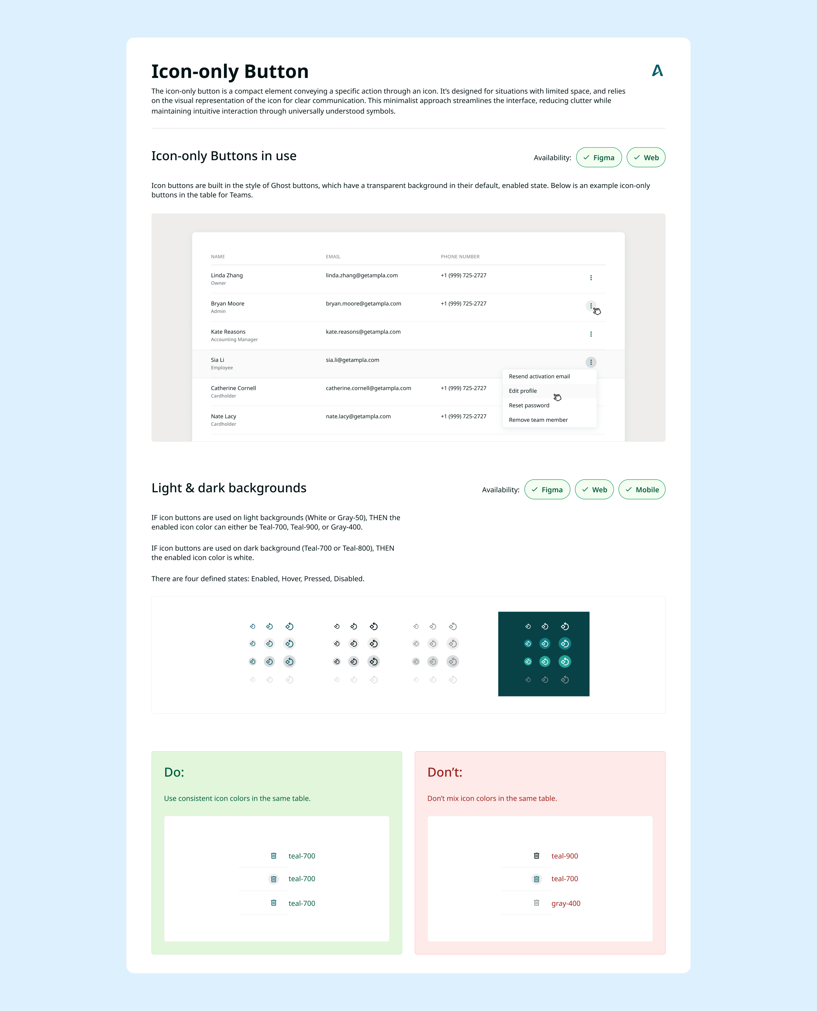
Within Figma, I always document the rules and use cases for components that I add or edit. This process helps me think through how users will be interacting with it. It was also critical to provide Figma guidelines for other designers who will be using the component.
Storybook component library
Additionally, I partnered closely with engineers to develop a Storybook component library, enhancing platform consistency. We formed a UX-Engineering team on Jira to create a backlog with tickets for building new components and refining existing ones. We hold weekly cross-disciplinary meetings to monitor progress and ensure everyone remains unblocked.
